圣诞节快到了,何不送给Ta一份程序员的浪漫
接下来是雪花❄,圣诞树🎄,新年💌和更好的我们世上本无圣诞老人,所有的礼物都来自爱你的人
今天给大家带来几个好看的基于HTML+CSS(+JS)的圣诞树,希望圣诞节那天圣诞老爷爷能把我喜欢的你塞到我床上
和 以及 我前两天刚做过,感兴趣的也可以看看我前两期的博客:
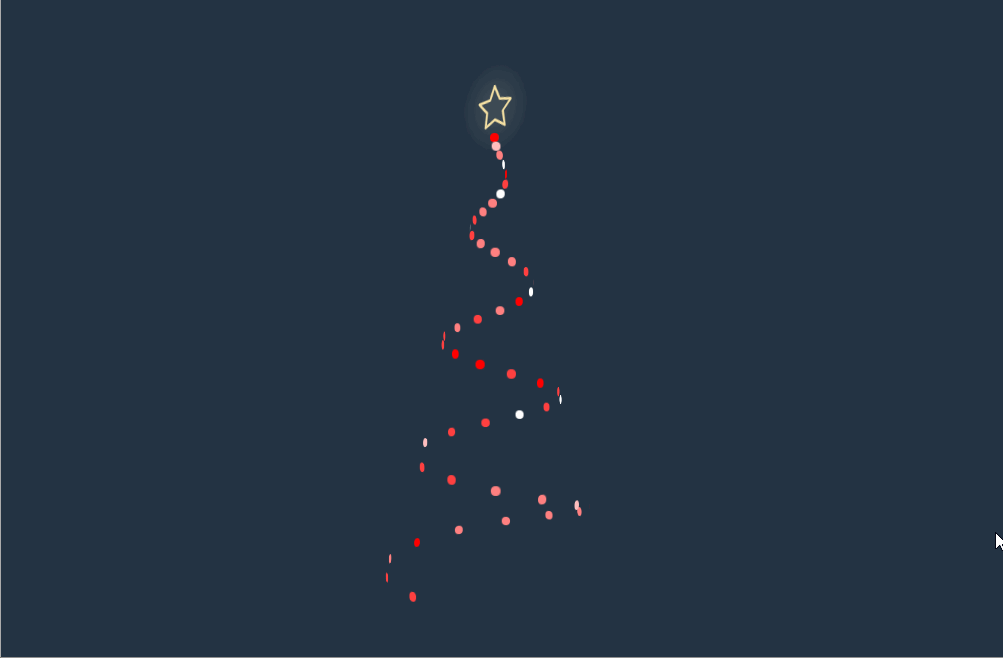
一、只使用 CSS 制作的动画圣诞树
演示地址:(建议使用电脑打开,没做响应式手机端会有些变形,或者可以看看后面的圣诞树)

HTML代码:
这里的HTML代码是完整无删减的
接下来是雪花,圣诞树,新年和
更好的我们
-
-
-
-
-
-
-
圣诞节快乐!
from haiyong
CSS主要代码
CSS比较多,我截取了部分主要代码,需要完整代码可关注公众号【海拥】回复【圣诞树】或者通过文章底部小卡片加我,发给你。
body {
  height: 100vh;
  display: flex;
  justify-content: center;
  align-items: center;
  color: #000;
}

ul {
  list-style-type: none;
}

ul li {
  display: inline-block;
}

h1 {
  font-family: "Mountains of Christmas", cursive;
  font-size: 42px;
  line-height: 60px;
  -webkit-background-clip: text;
  -webkit-text-fill-color: transparent;
}

h1::before, h1::after {
  content: "❆";
  margin: 0 10px;
}

h2 {
  font-family: "Source Sans Pro", sans-serif;
  font-size: 14px;
  text-transform: uppercase;
  letter-spacing: 2px;
}

h3 {
  font-family: "Open Sans Condensed", sans-serif;
  font-weight: 300;
  font-size: 18px;
  letter-spacing: 2px;
  margin-bottom: 5px;
}

p {
  font-family: "Dancing Script", cursive;
  font-size: 20px;
  font-weight: 700;
}

span {
  font-family: "Roboto", sans-serif;
  font-size: 14px;
  font-weight: 400;
}

.card-container {
  height: 675px;
  width: 675px;
  padding: 30px;
  background-color: rgba(255, 255, 255, 0.6);
  border: 8px double #fff;
  border-radius: 20px;
  text-align: center;
  border-radius: 50%;
  -webkit-border-radius: 50%;
  overflow: hidden;
  position: relative;
  -webkit-mask-image: -webkit-radial-gradient(white, black);
}
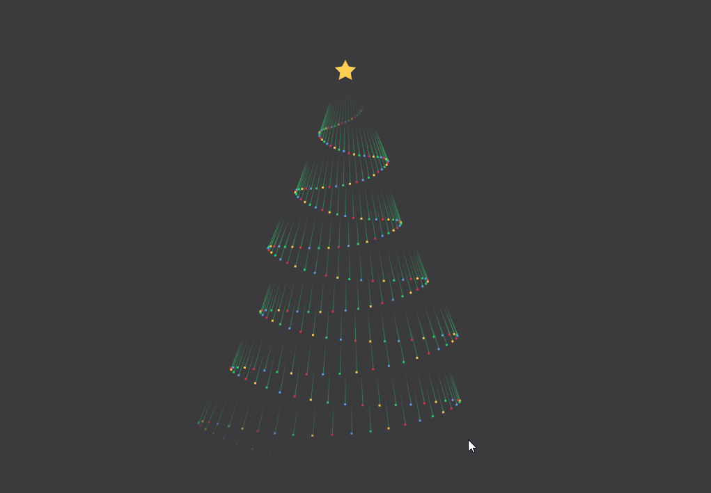
二、只使用 CSS 制作的螺旋圣诞树
HTML代码
完整CSS代码
复制粘贴即可,还有问题可以在底部评论区留言或者根据文末方式获取源码
* {
  box-sizing: border-box;
}
body {
  background: #233343;
  min-height: 100vh;
  display: flex;
  align-items: center;
  justify-content: center;
  perspective: 1200px;
  transform-style: preserve-3d;
}
.tree {
  position: relative;
  height: 50vmin;
  width: 25vmin;
  transform-style: preserve-3d;
  -webkit-animation: spin 2s infinite linear;
          animation: spin 2s infinite linear;
}
.tree__light {
  transform-style: preserve-3d;
  position: absolute;
  height: 1vmin;
  width: 1vmin;
  border-radius: 50%;
  -webkit-animation: flash calc(var(--speed) * 1s) calc(var(--delay) * 1s) infinite steps(4), appear 0.5s calc(var(--appear) * 0.05s) both;
          animation: flash calc(var(--speed) * 1s) calc(var(--delay) * 1s) infinite steps(4), appear 0.5s calc(var(--appear) * 0.05s) both;
  left: 50%;
  transform: translate(-50%, 50%) rotateY(calc(var(--rotate, 0) * 1deg)) translate3d(0, 0, calc(var(--radius, 0) * 1vmin));
  bottom: calc(var(--y, 0) * 1%);
}
.tree__star {
  stroke-width: 5vmin;
  stroke: #f5e0a3;
  filter: drop-shadow(0 0 2vmin #fcf1cf);
  height: 5vmin;
  width: 5vmin;
  overflow: visible !important;
  bottom: 100%;
  left: 50%;
  transform: translate(-50%, 0);
  position: absolute;
  stroke-dasharray: 1000 1000;
  fill: none;
  -webkit-animation: stroke 1s calc((var(--delay) * 0.95) * 0.05s) both;
          animation: stroke 1s calc((var(--delay) * 0.95) * 0.05s) both;
}
@-webkit-keyframes stroke {
  from {
    stroke-dashoffset: -1000;
  }
}
@keyframes stroke {
  from {
    stroke-dashoffset: -1000;
  }
}
@-webkit-keyframes spin {
  to {
    transform: rotateY(360deg);
  }
}
@keyframes spin {
  to {
    transform: rotateY(360deg);
  }
}
@-webkit-keyframes appear {
  from {
    opacity: 0;
  }
}
@keyframes appear {
  from {
    opacity: 0;
  }
}
@-webkit-keyframes flash {
  0%, 100% {
    background: #f00;
  }
  20% {
    background: #fff;
  }
  40% {
    background: #f00;
  }
  60% {
    background: #fff;
  }
  80% {
    background: #f00;
  }
}
@keyframes flash {
  0%, 100% {
    background: #f00;
  }
  20% {
    background: #fff;
  }
  40% {
    background: #f00;
  }
  60% {
    background: #fff;
  }
  80% {
    background: #f00;
  }
}
三、使用HTML+CSS+JS制作的圣诞树

HTML比较长,打包放在源码里,文末自行领取
完整CSS
body {
  background-color:#151522;
  overflow: hidden;
    display: flex;
  align-items: center;
  justify-content: center;
}

body,
html {
  height: 100%;
  width: 100%;
  margin: 0;
  padding: 0;
}


svg{
  width:90%;
  height:90%;
  visibility:hidden;

}
部分JS
MorphSVGPlugin.convertToPath('polygon');
  var xmlns = "http://www.w3.org/2000/svg",
    xlinkns = "http://www.w3.org/1999/xlink",
  select = function(s) {
      return document.querySelector(s);
    },
    selectAll = function(s) {
      return document.querySelectorAll(s);
    },
    pContainer = select('.pContainer'),
    mainSVG = select('.mainSVG'),
    star = select('#star'),
    sparkle = select('.sparkle'),
    tree = select('#tree'),
    showParticle = true,
    particleColorArray = ['#E8F6F8', '#ACE8F8', '#F6FBFE','#A2CBDC','#B74551', '#5DBA72', '#910B28', '#910B28', '#446D39'],
    particleTypeArray = ['#star','#circ','#cross','#heart'],
    particlePool = [],
    particleCount = 0,
    numParticles = 201


  gsap.set('svg', {
    visibility: 'visible'
  })

  gsap.set(sparkle, {
    transformOrigin:'50% 50%',
    y:-100
  })

  let getSVGPoints = (path) => {

    let arr = []
    var rawPath = MotionPathPlugin.getRawPath(path)[0];
    rawPath.forEach((el, value) => {
      let obj = {}
      obj.x = rawPath[value * 2]
      obj.y = rawPath[(value * 2) + 1]
      if(value % 2) {
        arr.push(obj)
      }
    })
    return arr;
  }
  let treePath = getSVGPoints('.treePath')
  var treeBottomPath = getSVGPoints('.treeBottomPath')
  var mainTl = gsap.timeline({delay:0, repeat:0}), starTl;
  function flicker(p){
    gsap.killTweensOf(p, {opacity:true});
    gsap.fromTo(p, {
      opacity:1
    }, {
      duration: 0.07,
      opacity:Math.random(),
      repeat:-1
    })
  }

  function createParticles() {
    var i = numParticles, p, particleTl, step = numParticles/treePath.length, pos;
    while (--i > -1) {

      p = select(particleTypeArray[i%particleTypeArray.length]).cloneNode(true);
      mainSVG.appendChild(p);
      p.setAttribute('fill', particleColorArray[i % particleColorArray.length]);
      p.setAttribute('class', "particle");
      particlePool.push(p);
      gsap.set(p, {
                   x:-100,
                   y:-100,
     transformOrigin:'50% 50%'
                   })
    }

  }

  var getScale = gsap.utils.random(0.5, 3, 0.001, true);

  function playParticle(p){
    if(!showParticle){return};
    var p = particlePool[particleCount]
   gsap.set(p, {
     x: gsap.getProperty('.pContainer', 'x'),
     y: gsap.getProperty('.pContainer', 'y'),
     scale:getScale()
      }
      );
  var tl = gsap.timeline();
    tl.to(p, {
      duration: gsap.utils.random(0.61,6),
        physics2D: {
          velocity: gsap.utils.random(-23, 23),
          angle:gsap.utils.random(-180, 180),
          gravity:gsap.utils.random(-6, 50)
        },
        scale:0,
        rotation:gsap.utils.random(-123,360),
        ease: 'power1',
        onStart:flicker,
        onStartParams:[p],
        //repeat:-1,
        onRepeat: (p) => {
          gsap.set(p, {
              scale:getScale()
          })
        },
        onRepeatParams: [p]

      });

    particleCount++;
    particleCount = (particleCount >=numParticles) ? 0 : particleCount

  }

  function drawStar(){

    starTl = gsap.timeline({onUpdate:playParticle})
    starTl.to('.pContainer, .sparkle', {
      duration: 6,
      motionPath :{
        path: '.treePath',
        autoRotate: false
      },
      ease: 'linear'
    })
    .to('.pContainer, .sparkle', {
      duration: 1,
      onStart:function(){showParticle = false},
      x:treeBottomPath[0].x,
      y:treeBottomPath[0].y
    })
    .to('.pContainer, .sparkle',  {
      duration: 2,
      onStart:function(){showParticle = true},
      motionPath :{
        path: '.treeBottomPath',
        autoRotate: false
      },
      ease: 'linear'
    },'-=0')
  .from('.treeBottomMask', {
      duration: 2,
    drawSVG:'0% 0%',
    stroke:'#FFF',
    ease:'linear'
  },'-=2')

  }


  createParticles();
  drawStar();
  //ScrubGSAPTimeline(mainTl)

  mainTl.from(['.treePathMask','.treePotMask'],{
    duration: 6,
    drawSVG:'0% 0%',
    stroke:'#FFF',
    stagger: {
      each: 6
    },
      duration: gsap.utils.wrap([6, 1,2]),
    ease:'linear'
  })
  .from('.treeStar', {
    duration: 3,
    //skewY:270,
    scaleY:0,
    scaleX:0.15,
    transformOrigin:'50% 50%',
    ease: 'elastic(1,0.5)'
  },'-=4')

   .to('.sparkle', {
    duration: 3,
      opacity:0,
      ease:"rough({strength: 2, points: 100, template: linear, taper: both, randomize: true, clamp: false})"
    },'-=0')
    .to('.treeStarOutline', {
    duration: 1,
      opacity:1,
      ease:"rough({strength: 2, points: 16, template: linear, taper: none, randomize: true, clamp: false})"
    },'+=1')
  mainTl.add(starTl, 0)
  gsap.globalTimeline.timeScale(1.5);
四、只使用 CSS 的流星圣诞树
HTML代码
CSS代码
:root {
  --background:#3C3B3D;
}

body {
  background: var(--background);
}
body ul {
  padding: 0;
}
body ul li {
  list-style: none;
}
body ul:nth-child(1) {
  position: absolute;
  top: 20vh;
  left: 50%;
  width: 1rem;
  height: 1rem;
  border-radius: 100%;
  transform: translate(-50%, -50%);
}
body ul:nth-child(1) li {
  position: absolute;
  width: 0;
  height: 0;
  border-width: 0 0.5rem 1rem 0.5rem;
  border-style: solid;
  border-color: transparent;
  border-bottom-color: #FFCE54;
  transform-origin: 0.5rem 1rem;
}
body ul:nth-child(1) li:nth-child(0) {
  transform: rotate(0deg);
}
body ul:nth-child(1) li:nth-child(1) {
  transform: rotate(72deg);
}
body ul:nth-child(1) li:nth-child(2) {
  transform: rotate(144deg);
}
body ul:nth-child(1) li:nth-child(3) {
  transform: rotate(216deg);
}
body ul:nth-child(1) li:nth-child(4) {
  transform: rotate(288deg);
}
body ul:nth-child(2) li {
  position: absolute;
  top: 20vh;
  left: 50%;
  width: 0.0625rem;
  height: 60vh;
  transform-origin: 50% 0%;
}
body ul:nth-child(2) li:nth-child(1) {
  transform: rotate(4.9322004015deg);
}
body ul:nth-child(2) li:nth-child(1):before, body ul:nth-child(2) li:nth-child(1):after {
  -webkit-animation-delay: -0.015625s;
          animation-delay: -0.015625s;
}
body ul:nth-child(2) li:nth-child(2) {
  transform: rotate(7.7960629984deg);
}
body ul:nth-child(2) li:nth-child(2):before, body ul:nth-child(2) li:nth-child(2):after {
  -webkit-animation-delay: -0.03125s;
          animation-delay: -0.03125s;
}
body ul:nth-child(2) li:nth-child(3) {
  transform: rotate(10.5294548885deg);
}
body ul:nth-child(2) li:nth-child(3):before, body ul:nth-child(2) li:nth-child(3):after {
  -webkit-animation-delay: -0.046875s;
          animation-delay: -0.046875s;
}
/* ...... */
/* 一样的规律,一直到第256 */
body ul:nth-child(2) li:nth-child(256) {
  transform: rotate(2deg);
}
body ul:nth-child(2) li:nth-child(256):before, body ul:nth-child(2) li:nth-child(256):after {
  -webkit-animation-delay: -4s;
          animation-delay: -4s;
}
body ul:nth-child(2) li:before, body ul:nth-child(2) li:after {
  content: "";
  position: absolute;
  top: 0%;
  -webkit-animation: fall 4s linear infinite;
          animation: fall 4s linear infinite;
}
body ul:nth-child(2) li:before {
  width: 0.0625rem;
  height: 3rem;
  background: linear-gradient(rgba(46, 204, 113, 0), rgba(46, 204, 113, 0.5));
}
body ul:nth-child(2) li:after {
  bottom: 0;
  transform: translate(-50%, 3rem);
  width: 0.1875rem;
  height: 0.1875rem;
  border-radius: 100%;
  background: #ffce54;
}
body ul:nth-child(2) li:nth-child(4n):after {
  background: #D8334A;
}
body ul:nth-child(2) li:nth-child(4n+1):after {
  background: #FFCE54;
}
body ul:nth-child(2) li:nth-child(4n+2):after {
  background: #2ECC71;
}
body ul:nth-child(2) li:nth-child(4n+3):after {
  background: #5D9CEC;
}

@-webkit-keyframes fall {
  0% {
    opacity: 0;
    top: 0%;
  }
  5% {
    opacity: 0;
  }
  15%, 90% {
    opacity: 1;
  }
  100% {
    opacity: 0;
    top: 100%;
  }
}

@keyframes fall {
  0% {
    opacity: 0;
    top: 0%;
  }
  5% {
    opacity: 0;
  }
  15%, 90% {
    opacity: 1;
  }
  100% {
    opacity: 0;
    top: 100%;
  }
}
五、水晶球里的圣诞树

CSS完整代码
html, body {
    margin:0;
    width: 100%;
    height: 100%;
    position: absolute;
    overflow: hidden;
    background: linear-gradient(135deg, rgba(180,186,214,1) 0%, rgba(232,203,192,1) 100%);
}

.content {
    text-align: center;
    width: 100%;
}

svg {
    max-width: 575px;
}

#canvas {
    border-radius: 50%;
    position: relative;
    width: 310px;
    height: 290px;
    top: 10px;
    left: 0px;
}

.canvas_container {
    position: absolute;
    width: 100%;
}

.draw_container {
    position: absolute;
    top: 50px;
    width: 100%;
}
JS完整代码
$(function() {
        var canvas = $("#canvas")[0];
        var ctx = canvas.getContext("2d");
        var WIDTH = 320;
        var HEIGHT = 320;
        canvas.width = WIDTH;
        canvas.height = HEIGHT;
        clearCanvas();

        var particles = [];
        for (var i = 0; i < WIDTH; i++) {
            particles.push({
                x: Math.random() * WIDTH,
                y: Math.random() * HEIGHT,
                r: Math.random() * 2 + 1
            })
        }

        function draw() {
            clearCanvas();
            ctx.fillStyle = "rgba(255, 255, 255, 0.6)";
            ctx.beginPath();

            for (let i = 0; i < WIDTH; i++) {
                let p = particles[i];
                ctx.moveTo(p.x, p.y);
                ctx.arc(p.x, p.y, p.r, 0, Math.PI * 2, true);
            }
            ctx.fill();
            update();
        }

        function update() {
            for (let i = 0; i < WIDTH; i++) {
                let p = particles[i];
                p.y += p.r;
                if (p.y > canvas.height) {
                    particles[i] = {
                        x: Math.random() * canvas.width,
                        y: -10,
                        r: p.r
                    };
                }
            }
        }
        var timer = setInterval(draw, 50);

        function clearCanvas() {
            ctx.clearRect(0, 0, canvas.width, canvas.height);
        }

    })
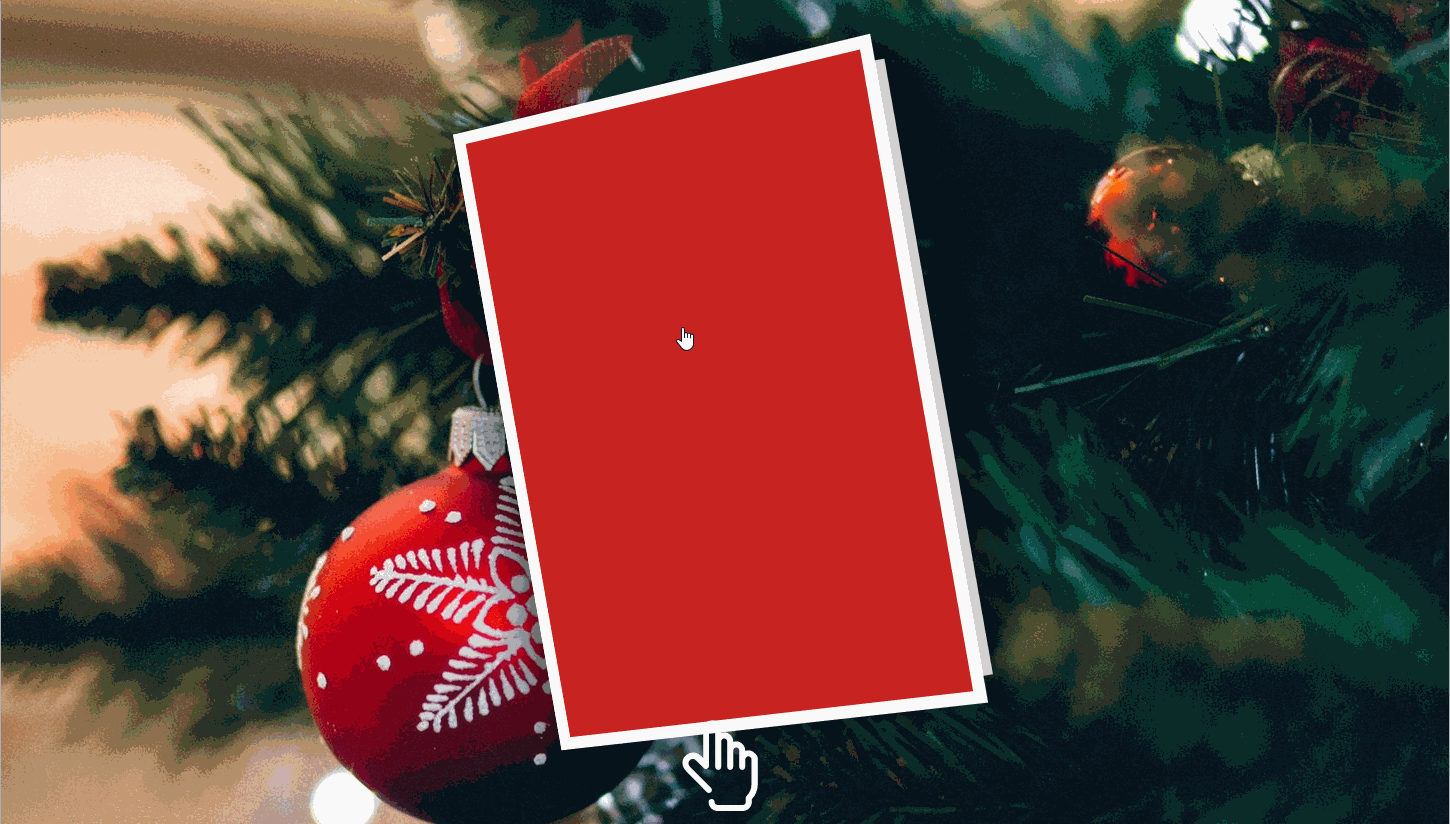
六、圣诞贺卡
还有更多好玩、有趣的文章,感兴趣可以看看:
本篇文章中的所有代码我都已打包好,就当做圣诞礼物免费送给大家,两种获取方式:
2.关注公众号【海拥】回复【圣诞树】获取