纯CSS实现beautiful按钮
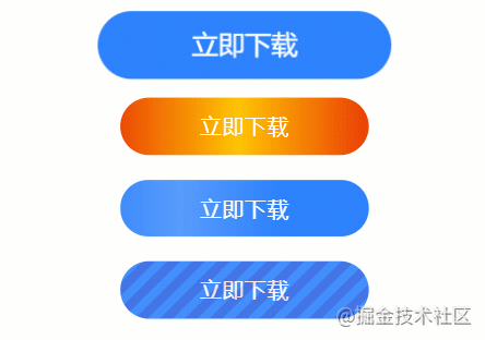
近期工作中遇到一个需求——实现一些酷炫的按钮,看到效果图之后,按钮确实漂亮,有弹跳、颜色渐变、扫光、霓虹灯,瞬间激起了我的好奇心,开启了研究实现之路。(欢迎关注公众号前端点线面)
一、基础储备
实现这些漂亮的按钮主要利用了一些CSS的属性,主要有animation、background-size、background-position、linear-gradient(),下面对这四个内容进行简要概述。
1.1 animation
animation: name duration timing-function delay iteration-count direction;
1.2 background-size
设置背景图片大小。图片可以保有其原有的尺寸,或者拉伸到新的尺寸,或者在保持其原有比例的同时缩放到元素的可用空间的尺寸,其语法如下所示,详细用法可参考:
background-size: length|percentage|cover|contain;
1.3 background-position
在使用这个属性时有一个位置必须特别注意,否则很难理解为什么background-position指定的位置和自己想要的不一样,这个位置就是其百分比的计算公式,通过下面公式就可以理解设定百分比后背景图片成了什么结果了:
background-postion:x y;
x:{容器(container)的宽度—背景图片的宽度}*x百分比,超出的部分隐藏。
y:{容器(container)的高度—背景图片的高度}*y百分比,超出的部分隐藏。
1.4 linear-gradient
函数用于创建一个表示两种或多种颜色线性渐变的图片。其结果属于数据类型,是一种特别的数据类型,其语法如下所示,详细用法可参考:
background-image: linear-gradient(direction, color-stop1, color-stop2, ...);
二、效果实现
下面的四种动画效果其实就是充分利用CSS属性实现的,让我们具体来看看都是如何实现的。
2.1 弹跳效果
第一种效果是弹跳效果,所谓弹跳效果就是按钮在大小之间变换,其思想如下:

.button1 {
    width: 200px;
    height: 46px;
    line-height: 46px;
    background: #2e82ff;
    color: #ffffff;
    font-size: 18px;
    border-radius: 27px;
    animation: zoomIn 1.5s infinite;
    text-align: center;
}
@keyframes zoomIn {
    50% {
      transform: scale(1.2);
    }
    100% {
      transform: scale(1);
    }
}
2.2 颜色渐变效果
第二种是颜色渐变效果,所谓颜色渐变效果就是颜色从一种颜色到另一种颜色,然后循环如此,其思想如下:

.button2 {
    display: inline-block;
    width: 200px;
    height: 46px;
    line-height: 46px;
    color: #ffffff;
    font-size: 18px;
    border-radius: 27px;
    text-align: center;
    background-image: linear-gradient(to right, #ff3300 0%, #eb4402 25%, #ffc404 50%, #eb4402 75%, #ff3300 100%);
    background-size: 200%;
    animation: colorGradient 1.5s infinite;
}

@keyframes colorGradient {
    0% {
        background-position: 0 0;
    }
    100% {
        background-position: 100% 0;
    }
}
2.3 扫光效果
第三种是扫光效果,所谓扫光指的就是一个白色透明颜色从一端不断向另一端扫描,其思想如下:

.button3 {
    width: 200px;
    height: 46px;
    line-height: 46px;
    background-color: #2e82ff;
    color: #ffffff;
    font-size: 18px;
    text-align: center;
    border-radius: 27px;
    position: relative;
}
.button3::before {
    content: "";
    position: absolute;
    left: 0px;
    width: 100%;
    height: 100%;
    background-image:
        linear-gradient(to right, rgba(255, 255, 255, 0) 30%, rgba(255, 255, 255, 0.2) 50%, rgba(255, 255, 255, 0) 70%);
    background-size: 200%;
    animation: wipes 1s infinite;
}
@keyframes wipes {
    0% {
        background-position: 0 0;
    }
    100% {
        background-position: 100% 0;
    }
}
2.4 霓虹灯效果
第四种是霓虹灯效果,所谓霓虹灯效果其实更像一种斜线在不断移动,其原理如下所示:

.button4 {
    width: 200px;
    height: 46px;
    line-height: 46px;
    background: #2e82ff;
    color: #ffffff;
    font-size: 18px;
    border-radius: 27px;
    text-align: center;
    position: relative;
    overflow: hidden;
}
.button4:before {
    content: "";
    position: absolute;
    left: 0px;
    width: 100%;
    height: 100%;
    background-size: 20px 20px;
    background-image: linear-gradient(135deg, rgba(255, 0, 0, 0.1) 0%, rgba(255, 0, 0, 0.1) 25%, rgba(255, 255, 255, 0.1) 25%, rgba(255, 255, 255, 0.1) 50%, rgba(255, 0, 0, 0.1) 50%, rgba(255, 0, 0, 0.1) 75%,rgba(255, 255, 255, 0.1) 75%, rgba(255, 255, 255, 0.1) 100%);
    animation: moveblock 0.5s linear infinite;
}
@keyframes moveblock{
    0% {
        background-position: 0px 0px;
    }
    100% {
        background-position: 20px 0px;
    }
}
1.如果觉得这篇文章还不错,来个分享、点赞吧,让更多的人也看到
2.欢迎关注公众号前端点线面,《前端百题斩》pdf版在等你